Home
Home
How to Use a Contrast Editor to Make Your Photos Stand Out
What Does a Contrast Editor Actually Do to Your Images?
At its core, a contrast editor is a tool designed to manipulate the dynamic range of an image. When you adjust contrast, you are essentially changing the ratio between the light and dark areas of a photograph. According to technical definitions, high contrast creates bold, deep shadows and bright, punchy highlights, while low contrast results in a flatter, more muted, or "dreamy" aesthetic (Pict.ai) .
The technical mechanism behind these editors involves pulling highlights and shadows apart or pushing them together. When you increase contrast, the editor identifies pixels that are already somewhat light and makes them lighter, while simultaneously making darker pixels even darker. This expands the tonal separation, making the subject appear more defined against its background.
Contrast vs. Brightness: The Crucial Difference
Many amateur editors confuse contrast with brightness, but they function very differently on a histogram. Brightness shifts the entire histogram to the left (darker) or right (lighter) without changing the relationship between the tones. Contrast, however, expands or contracts the histogram. If you imagine the histogram as a piece of elastic, brightness moves the whole string, while contrast stretches it from both ends.
The Sharpness Myth
It is a common misconception that increasing contrast restores missing detail or sharpens a blurry image. While high contrast can make an image look sharper by defining edges more clearly, it does not actually add information that wasn't captured by the sensor. In fact, aggressive contrast editing can often lead to data loss, a phenomenon known as "clipping" (Pict.ai) .
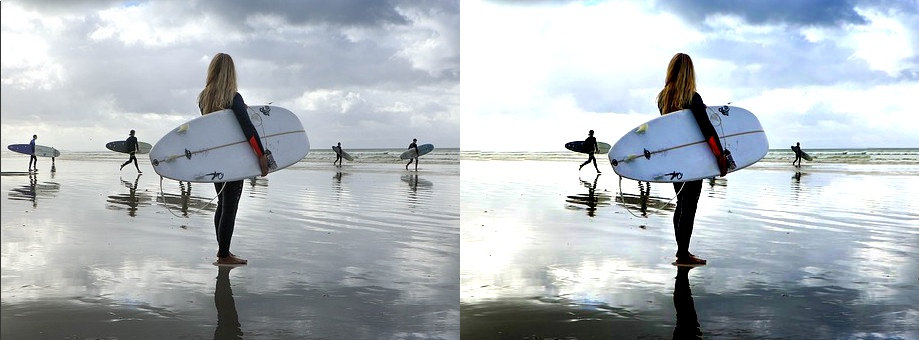
Image source: Gifgit
How to Adjust Contrast Online Without Uploading Your Private Files
In an era of increasing data breaches, privacy has become a primary concern for users editing sensitive materials. Many modern web-based contrast editors have adopted a privacy-first approach by utilizing client-side JavaScript. This means the image processing happens entirely within your browser's RAM; your photo is never actually sent to a remote server (Imageonline.co) .
This method offers several distinct advantages:
- Security: Ideal for editing government IDs, medical records, or private family photos where you cannot risk a server-side leak.
- Speed: Because there is no upload or download phase, the adjustments appear instantly, regardless of your internet connection speed.
- Offline Capability: Once the web app is loaded, many of these tools can continue to function even if you lose your connection.
File Format Support and Compatibility
A versatile contrast editor should support a wide array of formats. While JPG and PNG are standard, look for tools that handle WEBP for web optimization and HEIC/HEIF for photos taken on modern iPhones. Some specialized tools even allow you to adjust the contrast of animated GIFs, which is a top-tier feature for social media creators (Gifgit) .
Why Your Photos Look Flat and How to Fix Them
A "flat" photo is one where the histogram is bunched up in the middle, lacking true blacks or bright whites. This often happens in overcast weather or when using low-quality sensors. While a contrast editor is the logical fix, using the standard "global" slider can be destructive.
The "Dumb Slider" Warning
Expert photographers often warn against the "dumb" contrast slider found in basic apps. This slider applies a blanket mathematical formula to every pixel, which frequently results in "crushing" the shadows—turning dark gray areas into pure, detail-less black. Similarly, it can "blow out" highlights, turning subtle clouds into a solid white blob (Todd Dominey) .
| Feature | Manual Global Contrast | AI Adaptive Contrast |
|---|---|---|
| Detail Preservation | Low (Risk of clipping) | High (Preserves local detail) |
| Processing Method | Uniform mathematical shift | Selective pixel analysis |
| Best Use Case | Stylized, high-key art | Natural landscape & portraits |
| User Control | Full manual control | Automated with intensity slider |
Advanced Techniques for Professional Contrast Results
To move beyond basic edits, you must understand how contrast interacts with color and texture. Professional workflows often involve secondary checks to ensure the image retains its "punch" without looking artificial.
The Grayscale Harmony Technique
One of the most effective ways to judge contrast is to temporarily remove color. By converting your photo to black and white, you can clearly see the tonal range. A balanced image should have a clear black point, a clear white point, and a smooth gradation of grays in between. If the B&W version looks muddy, your color version will likely feel flat as well (Digital Photography School) .
The VSCO Workflow: Filters First
If you are using presets or filters, the order of operations matters. Experts at VSCO suggest applying your desired filter first and adjusting contrast last. Because filters often shift the black and white points of an image, adjusting contrast beforehand can lead to unpredictable results. Setting the contrast at the end allows you to "lock in" the final look and ensure the image has the correct amount of depth (VSCO) .
"Contrast is not just about making things darker or lighter; it's about creating a visual hierarchy that guides the viewer's eye to the most important part of the frame."
Using Contrast for Specific Tasks Like Document Scanning and Wildlife ID
Contrast editors are not just for art; they are essential utility tools for researchers and office professionals alike.
- Document Readability & OCR
- Increasing contrast is a standard step for Optical Character Recognition (OCR). By making text pitch black and the background pure white, software can more accurately identify characters in scanned IDs or old manuscripts (Pict.ai) .
- The iNaturalist Method
- In wildlife photography, high contrast can actually be a hindrance. Citizen scientists often lower contrast and raise shadows to reveal hidden patterns on a bird's feathers or an insect's wing that would otherwise be lost in harsh sunlight (iNaturalist Forum) .
- Scientific Multi-Channel Editing
- In fields like pathology, tools like QuPath require editors to manage contrast across up to 38 different channels simultaneously. Maintaining consistent contrast settings across a large dataset is a significant challenge for researchers (Image.sc Forum) .
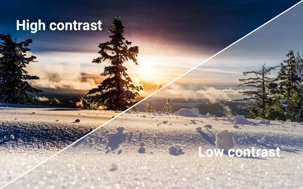
Image source: The Creative Hub for Photographers and Filmmakers | ShotVoice
How to Edit Photo Contrast on iPhone and Android Devices
Most users carry a powerful contrast editor in their pocket. Both iOS and Android have made significant strides in their native editing suites, though they approach the task differently.
Native iOS and Android Tools
Apple’s Photos app uses a "Smart Slider" for contrast. When you move the slider, the software intelligently adjusts related parameters like shadows and highlights to prevent the image from looking "fried." Android's Google Photos offers a similar "Enhance" feature that uses machine learning to suggest the optimal contrast level based on the scene type (e.g., portrait vs. landscape).
Third-Party Apps for Granular Control
For those who find native tools too limiting, apps like Lightroom Mobile and VSCO provide "Curves" tools. Instead of a single contrast slider, you can manually plot points on a graph to adjust the contrast of specific tonal ranges—such as increasing contrast only in the mid-tones while leaving the shadows untouched (VSCO) .
Frequently Asked Questions
Does increasing contrast reduce image quality?
It can. If you increase contrast too aggressively, you risk "clipping" your data. This means the subtle details in the darkest shadows become solid black, and the details in the brightest highlights become solid white. Once this data is clipped, it cannot be recovered, effectively reducing the overall quality and dynamic range of the file.
What is the best contrast setting for high-key photography?
High-key photography typically benefits from lower contrast to maintain a bright, airy feel. However, you still need enough contrast to define the edges of your subject against the light background. A common approach is to keep the global contrast low but use a "Clarity" or "Texture" tool to add local contrast to the subject's features.
Why does my photo look grainy after I increase contrast?
Increasing contrast amplifies the difference between pixels. If your original photo has digital noise (grain), especially in the shadow areas, boosting the contrast will make that noise much more visible. To fix this, try applying a noise reduction filter before you increase the contrast.
Can I adjust the contrast of a GIF?
Yes, though not all editors support it. Tools like Gifgit allow you to apply contrast filters to animated files. Keep in mind that GIFs have a limited color palette (256 colors), so heavy contrast adjustments may lead to "banding," where smooth gradients turn into blocky steps of color (Gifgit) .
Is there a free contrast editor that doesn't require a signup?
Several tools like PineTools, LunaPic, and Imageonline.co offer full contrast editing functionality without requiring an account or subscription. These are excellent choices for quick, one-off edits where you don't want to manage another login (PineTools) .
Key Takeaways for Perfect Contrast
- Understand Tonal Separation: Contrast is the gap between light and dark; use it to create depth, not just to make things "pop."
- Prioritize Privacy: Use browser-side tools for sensitive documents to ensure your data never leaves your device.
- Avoid the "Dumb Slider": Be cautious of global sliders that crush shadows; consider AI adaptive tools for complex scenes.
- Use the Grayscale Check: Convert to black and white to verify your tonal range before finalizing color edits.
- Order Matters: Apply filters or presets first, then use the contrast editor to fine-tune the final look.
- Check Your Histogram: Always monitor for clipping in the highlights and shadows to preserve maximum image data.
Start by opening your flattest photo in a browser-based editor today and try the grayscale harmony technique to see the hidden potential in your images.