Home
Home
How to Use a Saturation Editor to Make Your Photos Pop Without Looking Fake
A saturation editor allows you to adjust the intensity of colors in an image. To get professional results: 1. Upload your JPG, PNG, or WEBP file. 2. Use the Saturation slider to boost overall color or the Vibrance slider to protect skin tones. 3. Monitor for "color clipping" (loss of detail in bright areas). 4. Export in sRGB format to ensure colors look consistent across all devices and social media platforms.
Understanding the Basics of Color Intensity and Saturation
Saturation is often described as the "purity" or "volume" of a color. In technical terms, it represents the intensity of a specific hue relative to its own brightness. When you use a saturation editor, you are essentially determining how much of a specific pigment is present in the pixels of your image. A fully saturated color is vivid and deep, while a completely desaturated image becomes grayscale, stripped of all chromatic information.
According to Imagen AI , saturation has a profound psychological impact on the viewer. High saturation levels are typically associated with energy, vitality, and tropical warmth. Conversely, lower saturation levels can evoke feelings of nostalgia, intimacy, or even mystery. Understanding this emotional "volume knob" is the first step toward moving beyond simple slider dragging and toward intentional artistic expression.
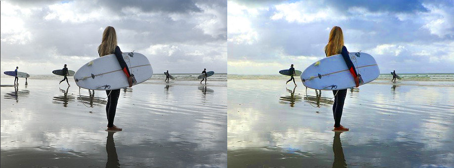
Image source: Gifgit
However, saturation does not exist in a vacuum. It is part of a complex relationship between light and color. In many digital editing environments, increasing the saturation can inadvertently make an image appear darker because the "purity" of the color replaces the "lightness" of the pixel. This is why professional colorists often view saturation as a tool for balance rather than just a way to make things "pop."
Three Simple Steps to Adjust Image Saturation Online
Most modern web-based tools have simplified the process of color correction, making it accessible to hobbyists and professionals alike. While the interface may vary, the fundamental workflow remains consistent across most platforms.
Step 1: Uploading Your Source File
Start by selecting a high-quality source image. While most editors support standard formats like JPG and PNG, using a lossless format or a modern high-efficiency format like WEBP can help preserve color data during the editing process. If you are working with mobile photos, ensure your editor supports HEIC files, which are common on iOS devices. The higher the initial bit depth of your image, the more room you have to push the saturation before the image begins to "break" or show digital artifacts.
Step 2: Applying the Adjustment
Once your image is loaded, locate the saturation slider. Moving the slider to the right increases the richness of every color in the frame. Moving it to the left removes color. A common mistake is to apply a massive boost immediately. Instead, try small increments. Many professionals suggest that a saturation level of approximately 1.306 represents a "natural" enhancement for most outdoor photography, whereas pushing past 1.6 can lead to significant data loss in the highlights.
Step 3: Exporting for the Web
After achieving the desired look, the export settings are critical. For web use, PNG is often a top-tier choice for preserving quality, though JPG is more efficient for file size. Crucially, ensure the color space is set to sRGB. This is the standard for web browsers and mobile screens, ensuring that the vibrant red you see in your editor doesn't turn into a dull brick-orange when viewed on someone else's phone.
Why Your Photos Look Orange or Neon After Editing
One of the most frequent complaints from new editors is that their photos look "fake" or "neon" after a few adjustments. This usually happens because of the "Global Slider Problem." A standard saturation editor treats every pixel the same way. If you have a landscape with a blue sky and a person in the foreground, increasing the saturation to make the sky bluer will also increase the saturation of the person's skin.
Identifying and Preventing Color Clipping
Color clipping occurs when the color intensity of a pixel exceeds the maximum value that your screen or file format can display. Imagine a bucket of water; once it's full, any additional water just spills over the side. In digital imaging, once a color "clips," you lose all the texture and detail in that area. A bright red rose might turn into a solid, flat blob of red with no visible petals.
To avoid this, watch the brightest and most colorful parts of your image as you move the slider. If you see details disappearing into a solid wall of color, you have pushed the saturation too far. This is particularly common in bright sunlight or with artificial neon lights.
Saturation vs Vibrance and Which One You Actually Need
If saturation is a blunt instrument, vibrance is a "smart" tool. While both affect color intensity, they do so using very different logic. Understanding this distinction is one of the most effective ways to improve your photo editing workflow.
Vibrance specifically targets the less-saturated colors in an image while leaving the already-saturated colors alone. It also includes a built-in protection for skin tones, making it a much safer choice for photos containing people. According to VSCO , vibrance is often the preferred method for social media editing because it creates a vivid look without the harshness of global saturation.
| Feature | Global Saturation | Vibrance |
|---|---|---|
| Target Pixels | All pixels equally | Muted/Dull pixels only |
| Impact on Skin | High (turns skin orange/red) | Low (protects natural tones) |
| Risk of Clipping | High | Low |
| Best Use Case | Landscapes, Artistic B&W | Portraits, Social Media |
How to Use HSL for Selective Color Correction
For those who want total control, the HSL (Hue, Saturation, Luminance) panel is a significant advancement over a single slider. HSL allows you to target specific color channels—Red, Orange, Yellow, Green, Aqua, Blue, Purple, and Magenta—independently.
Consider a photo of a forest under a blue sky. If the greens look dull but the sky is already perfect, a global saturation boost would ruin the sky. With HSL, you can select the "Green" channel and increase its saturation specifically. This selective approach allows for a level of precision that standard editors cannot match. You can also use the "Luminance" slider within the HSL panel to make specific colors brighter or darker, which adds a sense of three-dimensional depth to the image.
The Technical Trinity of Saturation Brightness and Contrast
In the world of professional image processing, saturation is rarely adjusted in isolation. It is part of what we call the "Technical Trinity": Saturation, Brightness, and Contrast. These three settings are inextricably linked.
When you increase the brightness of an image, the colors often appear "washed out" or thinner. To compensate for this, you almost always need to increase the saturation and contrast to maintain the image's visual weight. Conversely, if you are creating a moody, low-brightness image, you may need to lower the saturation to prevent the colors from looking unnaturally heavy in the shadows. As noted by Adorama's photography experts , balancing these three elements is the secret to a "finished" look that feels professional rather than edited.
How to Avoid the Color Profile Trap on Different Screens
Have you ever edited a photo until it looked perfect on your laptop, only to upload it to Instagram and find it looks neon-bright or strangely dull? This is the "Color Profile Trap." Different devices and software interpret color data differently.
Most professional editors work in a wide color space like Adobe RGB or ProPhoto RGB, which contain more colors than the human eye can even see. However, most consumer screens and web browsers are limited to the sRGB color space. If you export a highly saturated image in Adobe RGB, the browser will try to "guess" how to display those colors in sRGB, often resulting in a muddy or overly vibrant mess. According to discussions in the Adobe Community , always converting to sRGB before saving for the web is the most reliable way to ensure consistency.
Advanced Monitoring with the Vectorscope for Professional Accuracy
While most casual users rely on their eyes, professional colorists use a tool called a vectorscope . A vectorscope is a circular graph that maps out the hue and saturation of an image. The further the "dots" are from the center of the circle, the more saturated the image is.
The vectorscope features "targets" for primary colors. If the data points on the scope fly outside these targets, it is a mathematical certainty that your colors are clipping and will not display correctly on standard television or web monitors. Using a vectorscope allows you to push your saturation to the absolute limit of what is "legal" for broadcast or high-end web display without ever crossing into the territory of data loss. While not all online saturation editors include a vectorscope, understanding the concept helps you visualize color as a physical boundary that shouldn't be breached.
Creative Use Cases for Desaturation and Moody Aesthetics
While most people use a saturation editor to add color, there is immense creative power in taking it away. Desaturation isn't just for making things black and white; it's a tool for setting a specific mood.
The Vintage Look
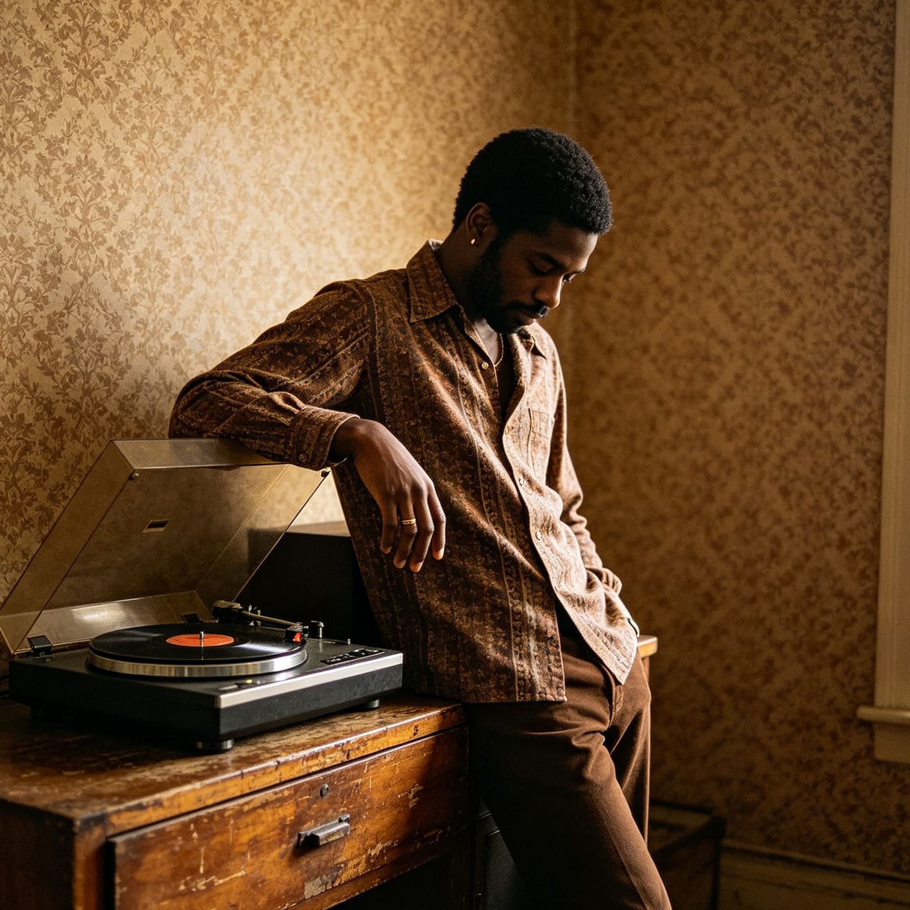
Lowering saturation by 20-30% and adding a slight warm tint can replicate the look of faded film photography from the 1970s.
Cinematic Noir
Heavy desaturation combined with high contrast creates a dramatic, "gritty" feel often used in modern crime dramas.
Minimalist Product Photography
Desaturating everything except the product itself (using HSL) helps the subject stand out in a clean, modern way.
Setting saturation to zero is the first step in a professional black-and-white workflow, but it shouldn't be the last. Once the color is gone, you must rely entirely on contrast and luminance to define the shapes in your image. A photo with zero saturation and low contrast will look flat and uninteresting; increasing the contrast helps "carve" the image out of the gray tones.
Final Takeaways for Mastering Color Intensity
Mastering a saturation editor is about restraint and understanding the technical limits of digital displays. Here are the key points to remember:
- Prioritize Vibrance for portraits to keep skin tones looking natural and healthy.
- Use HSL sliders for selective control, such as deepening a blue sky without affecting the rest of the image.
- Monitor for clipping by ensuring that bright, colorful areas don't lose their internal texture and detail.
- Balance the Trinity by adjusting contrast and brightness alongside saturation for a cohesive look.
- Export in sRGB to guarantee that your edits look the same on every screen and social platform.
- Aim for the 1.3x ratio as a baseline for natural-looking enhancements in outdoor photography.
Start by making small, incremental adjustments and always compare your edited version to the original to ensure you haven't lost the soul of the photo in pursuit of vividness.
Frequently Asked Questions
What is the difference between saturation and vibrance?
Saturation is a global adjustment that increases the intensity of every color in an image equally. Vibrance is a "smart" adjustment that primarily targets the more muted colors while leaving already-saturated colors alone. Vibrance also protects skin tones, making it a top-tier choice for portraits, whereas saturation is better suited for landscapes or artistic edits where you want a uniform boost.
Why does my photo look grainy after I increase the saturation?
Saturation doesn't just amplify color; it also amplifies the existing digital noise in your image. If a photo was taken in low light with a high ISO, there is "chroma noise" (colored speckles) hidden in the pixels. When you boost the saturation, you are making that noise more vivid and noticeable. To fix this, you may need to apply noise reduction before or after your saturation adjustment.
Can I edit photo saturation without downloading software?
Yes, there are many browser-based saturation editors that offer professional-level tools like HSL sliders and vibrance controls. These tools are highly effective for quick edits and social media posts. However, for large-scale printing or high-end commercial work, dedicated desktop software is often preferred for its ability to handle larger file sizes and more complex color profiles.
What is the best saturation level for Instagram?
While there is no single "perfect" number, many successful creators aim for a saturation boost of 10% to 20% (or a 1.2x to 1.3x multiplier). Instagram's compression can sometimes slightly dull colors, so a small boost helps the image stand out in a feed. However, avoid going too far, as mobile screens are often already set to a high-saturation display mode, which can make over-edited photos look neon.
Does increasing saturation reduce the overall image quality?
Technically, yes, if pushed to extremes. Increasing saturation is a destructive process that stretches the existing color data. If you push it too far, you will experience "banding" (visible steps between colors) and "clipping" (loss of detail). To maintain the highest quality, always work with the highest resolution file possible and make adjustments in small, careful steps.